Elevate your performance reporting by mastering advanced Excel charts. Create clear, impactful visuals that ensure your message is understood by executives and stakeholders.
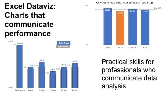
Professionals who have to communicate performance data to executives and other stakeholders can improve their presentations and reports by using visuals instead of a table of numbers. This course teaches you practical techniques to create different charts in Excel to communicate performance.
Participants will learn to measure and compare data against relevant standards, use message-driven chart titles, and apply techniques that highlight insights for decision-makers. With a modular approach, the course guides learners through building effective visuals such as column and bar charts, using lines and markers for standards, and integrating worksheet-driven automation.
Perfect for analysts, managers, and presenters, this course emphasizes clarity, visual storytelling, and Excel proficiency to elevate reporting and communication.

Dave Paradi has been recognized by the media and his clients as a presentation expert. He has authored ten books on effective PowerPoint presentations and his ideas have appeared in publications around the world. Dave is one of fewer than ten people in North America recognized by Microsoft with the Most Valuable Professional (MVP) Award for his contributions to the PowerPoint, Excel, and Teams communities. His articles and videos on virtual presenting have been viewed over 3.5 million times and liked over 14,000 times on YouTube. He is a highly rated conference speaker and has delivered more than 500 customized training sessions around the world in the last 23 years.
